Mubarak Abubakar

DonorFlow Mobile App

Simplified donation process while fostering a sense of community and accountability.

Role

Product Designer (UX Research, UI/UX, Interaction Design)

Timeline

4 Weeks (Design → Development → Testing → Launch)

Tools

Figma and Notion

Deliverables

User Research, user flows, wireframes, high-fidelity UI, prototypes, usability testing report

Project Overview

DonorFlow is a mobile application designed to make charitable giving easy, transparent, and rewarding. The app aims to simplify the donation process while fostering a sense of community and accountability. This case study outlines the design process and decisions made to create an intuitive and engaging user experience for DonorFlow.

Problem Statements

Charitable giving is often hindered by complex processes, lack of transparency, and insufficient feedback to donors. Potential donors face difficulties in identifying trustworthy charities, tracking the impact of their contributions, and feeling connected to the causes they support. DonorFlow seeks to address these challenges by providing:

  • A streamlined donation process.

  • Transparent fund allocation tracking.

  • Community features to engage donors with shared causes.

  • Rewards and recognition for charitable contributions.

Goals


Ease of Use: Simplify the donation process to reduce friction.

Transparency: Provide detailed impact reports for donations.

Community Engagement: Foster a sense of belonging among donors.

Accountability: Strengthen donor trust with traceable fund distribution

Our Target Audience

Primary Users

Young professionals, philanthropists, and individuals interested in supporting causes.

Secondary Users

Nonprofit organizations looking for a platform to attract and retain donors.

Demographics

Ages 18-45, tech-savvy, with an interest in social impact and sustainability.

Design Process

User Research

Conducted competitive analysis, which helped identify opportunities to reduce stress and increase satisfaction.

User Flow

Focused on a simplified user journey for smaller screens.

Wireframes

Low-fidelity wireframes were created to test the basic flow: Signup flow, Homepage, Donation flow, Impact Reports

UI Design

Adopted responsive design principles with a clean, intuitive layout.

Testing

Usability tests ensured smooth navigation and functionality on mobile devices.

Competitive Analysis

We analyzed leading platforms  like GoFundMe, Charity Navigator, and Benevity to understand gaps and opportunities. While these platforms offer unique features, they lack a comprehensive focus on community engagement and personalized rewards.

What Competitors Do Well

  • GoFundMe: Strong storytelling approach through campaigns

  • Charity Navigator: Rigorous charity evaluation and trust indicators

  • Benevity: Corporate giving and large-scale impact reporting

Opportunity for DonorFlow

Design an all-in-one donation ecosystem where giving is simple, transparent, community-driven, and personally rewarding, aligned with SDG 17 (Partnerships for the Goals) by bridging donors and organizations.

Key Insights

1. Transparency Is the Top Driver of Trust (SDG 16 – Peace, Justice & Strong Institutions)

Users feel more confident when they can visually see how donations are utilized.

2. Community Strengthens Motivation

Donors are more likely to give repeatedly when connected with others who share similar values.

3. Users Want Quick, Low-Friction Donation Flows

A busy lifestyle means donation experiences must be optimized for speed and convenience.

Personas

Emma

Occupation: Compassionate Professional

Age: 32

Goals: Donate regularly to causes she cares about, track her impact.

Pain Points: Limited time to research charities, unclear fund utilization.

David

Occupation: Social Giver

Age: 25

Goals: Engage with a community of like-minded donors.

Pain Points: Lack of recognition for donations, & difficulty finding organizations.

Stella

Occupation: Writer

Age: 27

Goals: Simplify the donation process to reduce friction.

Pain Points: Limited communities to engage with other donors.
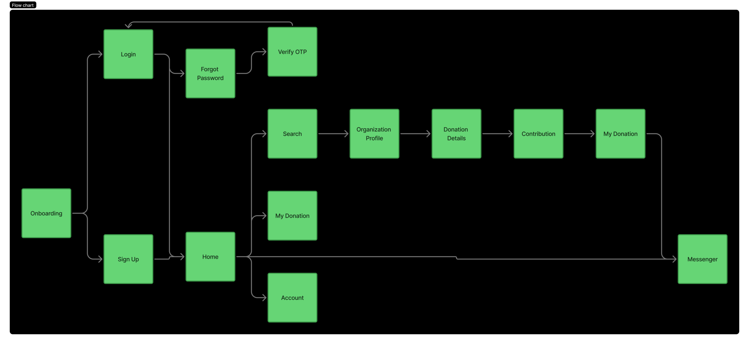
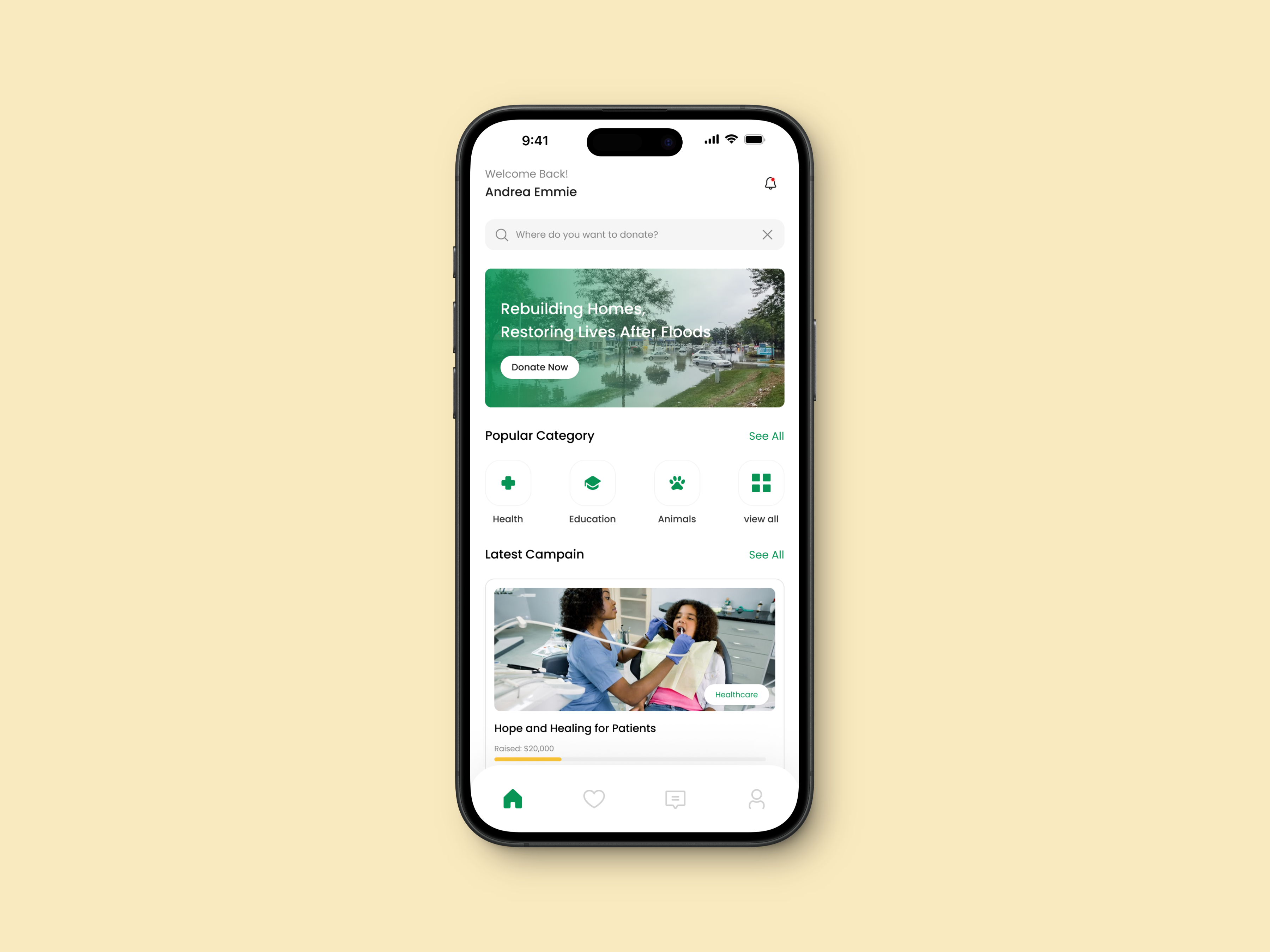
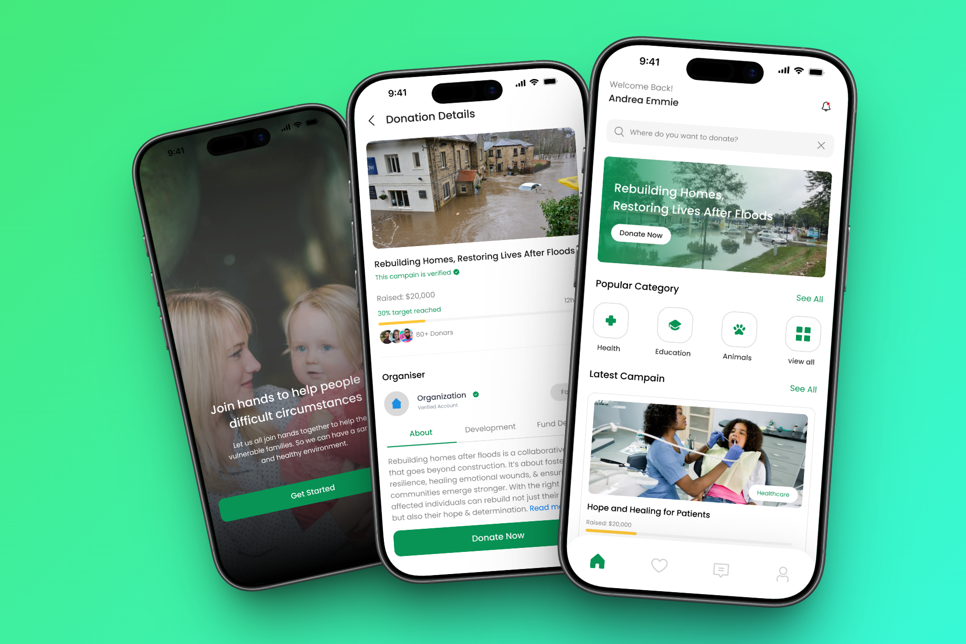
User Flows

I created a user flow to map out the app structure.

Wireframes

I created some low-fidelity wireframes to map out the core screen, test structure, and define layout priorities, before diving into visual design.

Design Solutions

The DonorFlow Mobile App aims to simplify the donation process while fostering a sense of community, transparency and accountability. The solution will offer:

Home Screen

A personalized dashboard showcasing recommended charities, user milestones, and quick donation options.
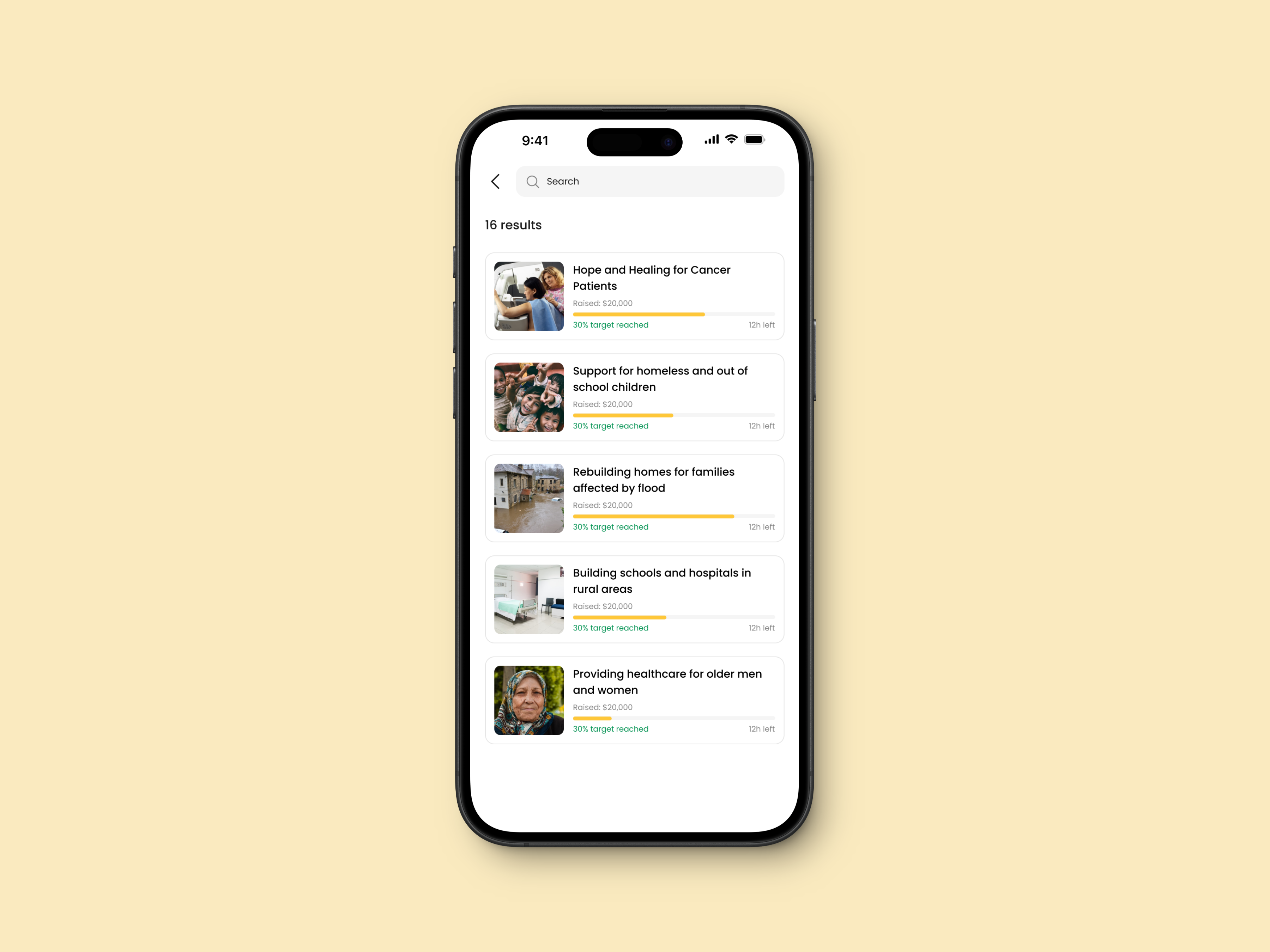
Search and Filter

Advanced search with filters for causes, locations, donations, and impact levels.
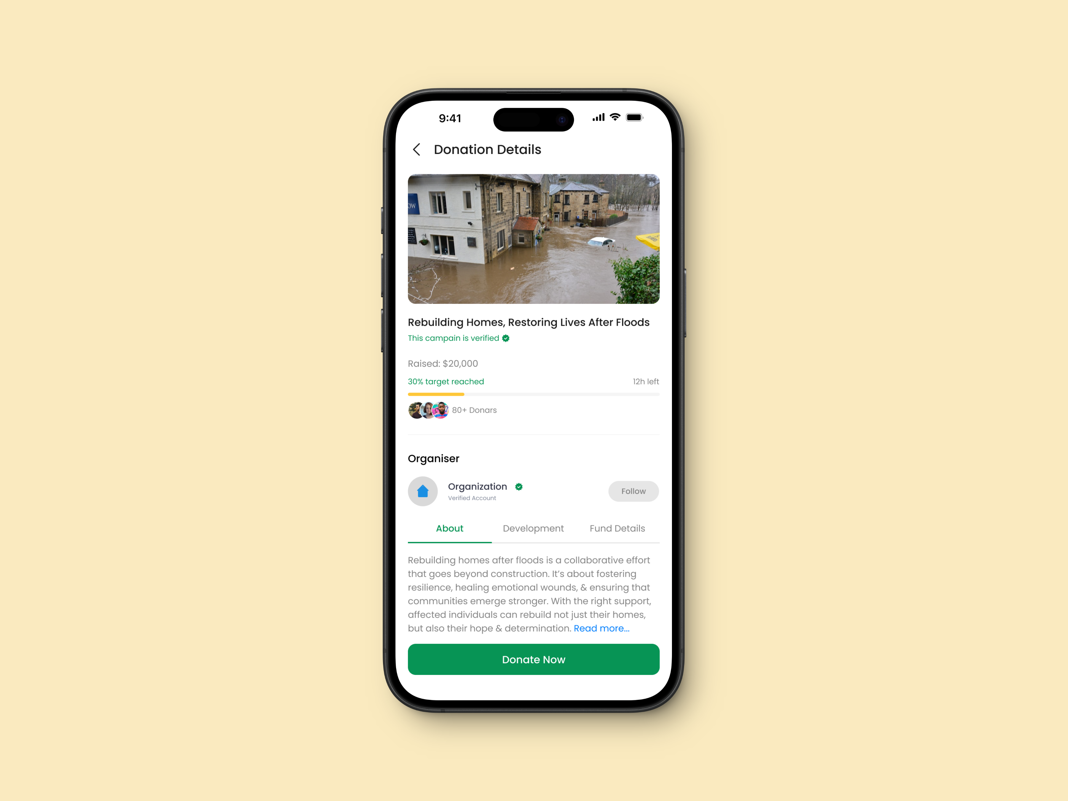
Donation Details

Real-time updates on how donations are making a difference, supported by photos, videos, and progress reports.
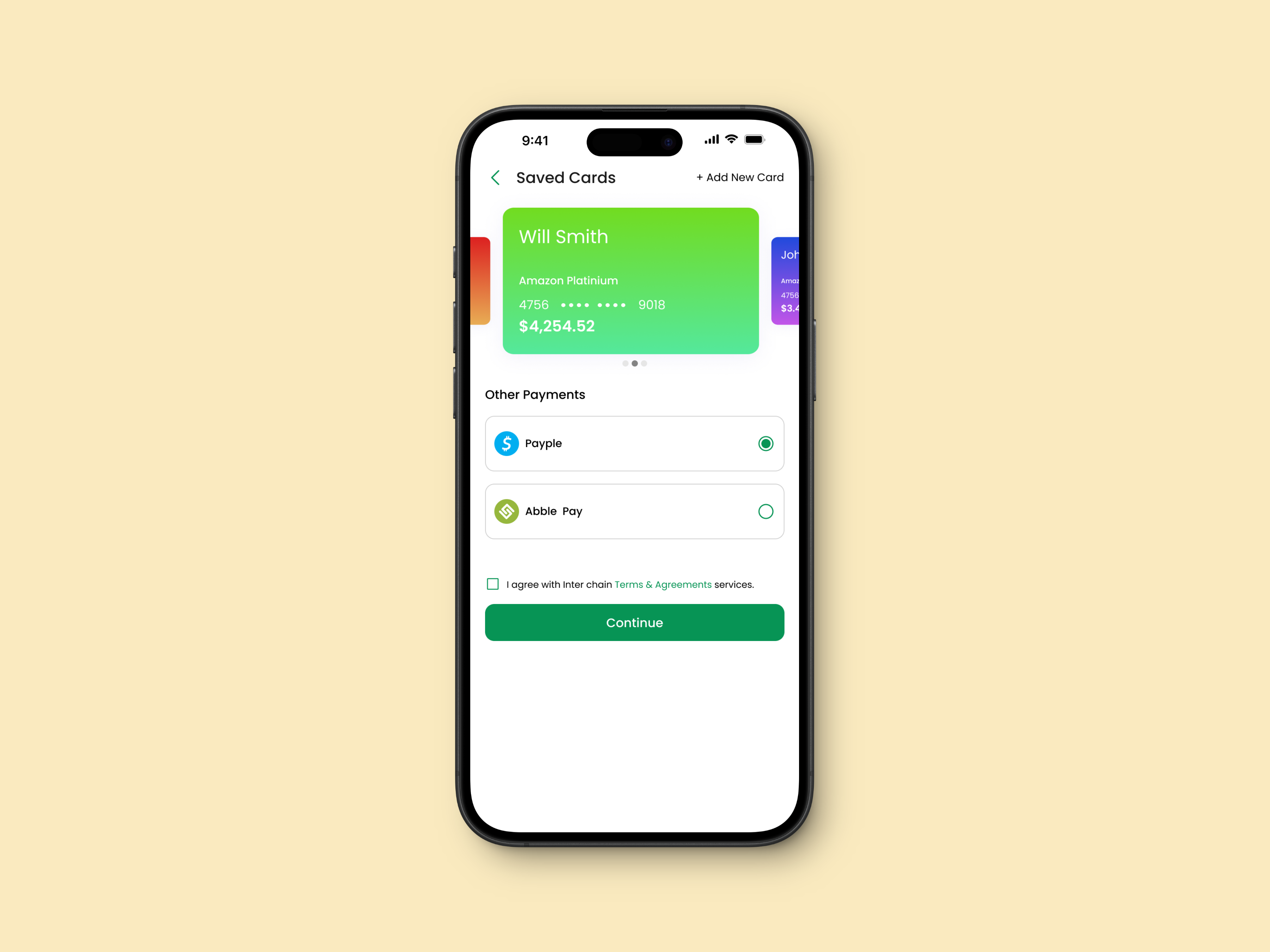
Payment Methods

Provision of different payment methods to simplify donation process for donors.

Other Screens

Key Takeaway

  • Transparency Builds Trust: Clear and detailed impact reporting increases user confidence.
  • Community Matters: Users feel more motivated when they can connect with like-minded individuals.
  • Iterative Design is Key: Frequent testing and iteration led to significant improvements in usability.

Conclusion

DonorFlow eliminates barriers to charitable giving by simplifying processes, ensuring transparency, and promoting long-term engagement. Its user-centered design approach makes giving back both impactful and enjoyable.

By supporting SDG 16 and 17, DonorFlow contributes to a more equitable and sustainable world, empowering users to engage meaningfully with causes they care about.