Independent project · 2025
iFoundIt: a visual-first home inventory app
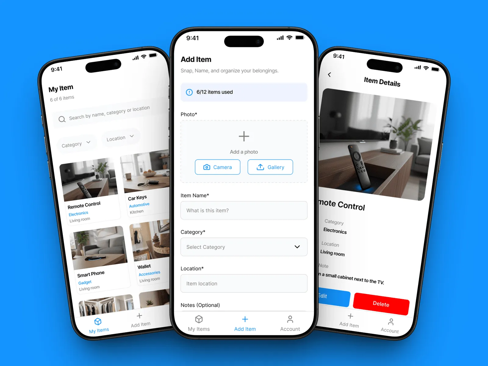
A consumer app for remembering where household things live. Photograph an item, tag it, find it later. Designed in Figma and vibe-coded to production solo, shipped to the App Store with thousands of users, built around one target: add an item in under ten seconds.
- Role
- Sole designer & builder
- Platform
- iOS
- Timeline
- 2025 · live
- Team
- Solo: Figma to production
- UX research
- Information architecture
- UI & interaction design
- Prototyping & usability testing
Context
People lose track of their own things: documents, chargers, keys, the box the router came in. The tools that exist for this are inventory systems: text-heavy, complex, built for businesses. iFoundIt is the opposite: a visual-first app for everyday home use, designed and shipped in a four-week cycle (research → design → build → test → launch).
The problem
Household organisation fails because logging an item is more effort than just risking losing it. Any solution has to make capture almost free, or people won’t do it twice.
Target users
- Busy professionals who forget where they filed a document or stored an accessory
- Students in shared apartments who need to keep track of their own things
- Families managing a lot of stuff across a household
What I did
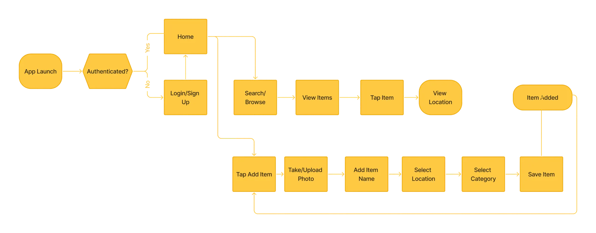
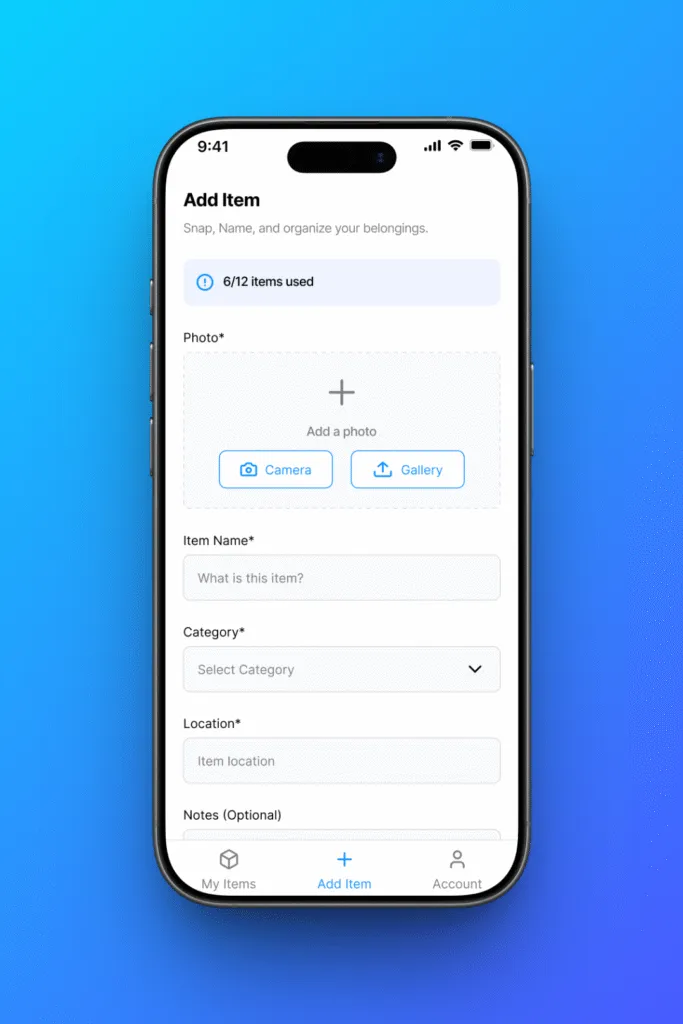
- Designed the capture flow to hit a hard target: add an item in under ten seconds. Photo first (camera or gallery), then name, category and location, notes optional.
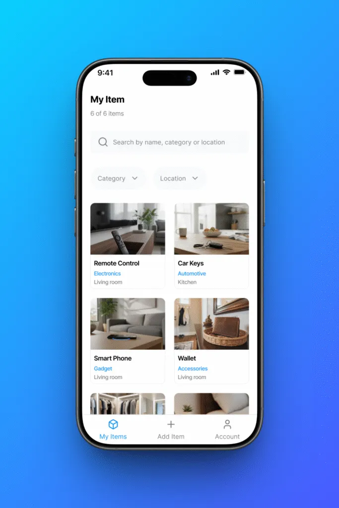
- Made the app visual-first: the item list is a grid of photo tiles with category and room, not rows of text.
- Kept search and category / location filters one tap from the list.
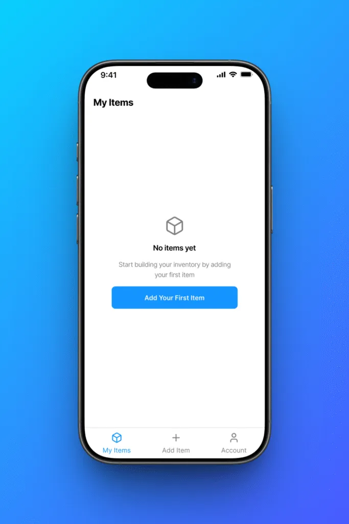
- Designed onboarding to be minimal: get to a first item fast, because the first item is what predicts whether someone comes back.
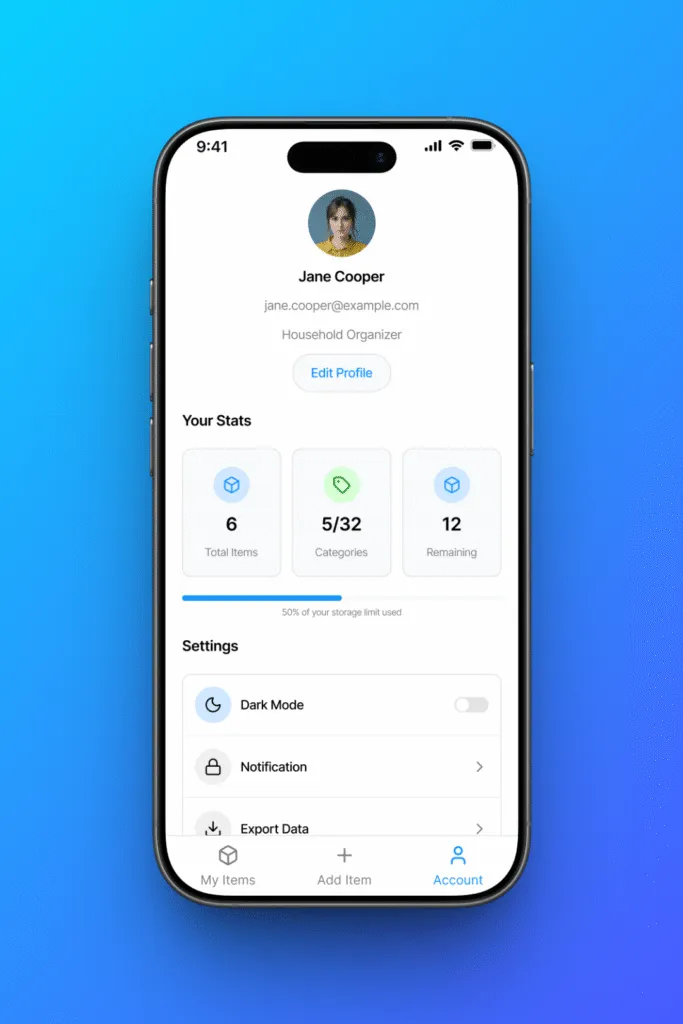
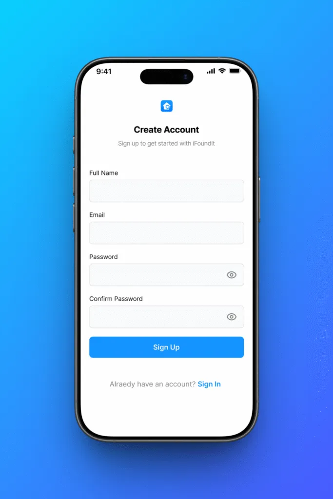
- Designed the empty, account and auth states (sign up / sign in / reset password).
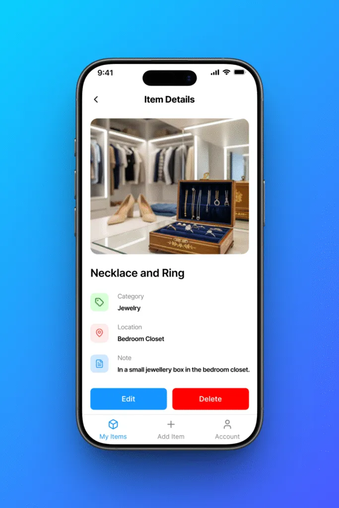
Key decisions
Photo before form. The first thing you do is take the picture; everything else is secondary and mostly optional. This is what gets capture under ten seconds.
A grid, not a list. You recognise your own stuff by sight faster than by name, so the primary view is images.
Strip onboarding to the bone. Fewer steps before the first item; retention is set in the first session.
Outcome
Designed end to end and shipped to the App Store, built around a sub-ten-second capture target.
It’s live on the App Store with a few hundred downloads and no paid acquisition. The metrics that matter are still early, so I hold them as targets, not results: activation (users who add a second item in the first session), week-two return, and review sentiment. Retention is the real test, since a home inventory only pays off once there’s enough in it to search.
Shipping in weeks instead of quarters taught me that the first honest feedback arrives while the decisions are still cheap to undo. What I’d change now: capture is tuned for the first item, but the people who stay are managing dozens, so the next pass is bulk entry, stronger categories, and search built for a full house, not an empty one.